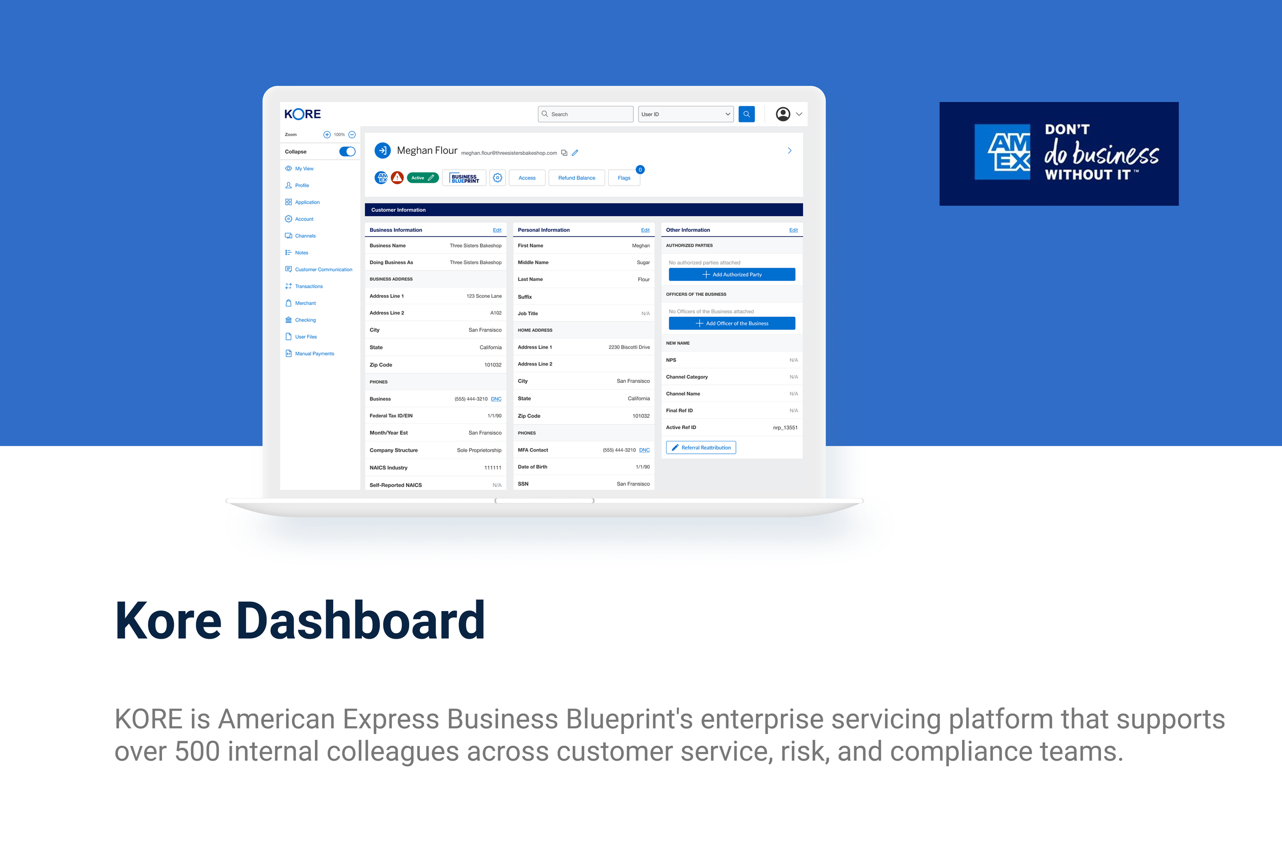
Kore

I was a Product Designer at American Express and served as the lead designer for Kore, the internal servicing platform within American Express’s Business Blueprint. For two years, I led end-to-end design efforts to improve my colleagues’ workflow and our users’ experience with platform servicing. I worked on every aspect from UX research and journey mapping to building a scalable design system (both web and mobile). I delivered UI and UX solutions for complex projects and led a full platform redesign, managing everything from user research and workflow analysis to wireframing, prototyping, and high-fidelity design. I collaborated closely with cross-functional partners, including the VP of Product and the broader Product team, to deliver user-centered experiences that improved colleague efficiency and supported platform scalability.

Overview

Kore is a custom-built servicing platform originally used by the team, and had a mix of legacy users and new users. The sticky header was the first component we tackled because of its high usage in servicing workflows.

As part of my non-disclosure agreement, any confidential information has been removed from this case study. Any views reflected here are my own and do not represent the views of American Express.

Process

Research → Synthesis → Ideation → Prototyping → Testing → Iteration→ Delivery → Conclusion/Reflection

Research

To start, I conducted qualitative research through interviews with servicing agents (0–5 years of experience) and shadowed their workflows to understand how they navigated Kore. Partnering with Product Managers, we identified key tasks and mapped out the customer verification journey. Common pain points included information overload, unclear navigation, and repetitive actions that slowed down calls. These insights shaped our design priorities and helped secure stakeholder buy-in for a phased redesign.

“I usually ignore half of what’s up there because it’s not relevant to most calls.”
-Amex Service Agent

“Sometimes I’m copying things into my Notes app just to keep track of important info while I navigate through different sections.”
-Amex Service Agent

Whiteboarding Solutions

After our research phase and discussing our findings, we went to the whiteboard to visualize our ideas. The first flow we wanted to tackle was verifying the customer. When a customer calls in regardless of their issue, the first thing they have to do is verify their identity by giving an email address or physical address associated with their account. Using our user journey maps, I began iterating on designs.

Iteration and Prototyping

Based on research insights, I created low- to high-fidelity prototypes in Figma to explore ways to simplify Kore’s workflows. I focused on fast iteration, testing early concepts with stakeholders and agents to gather feedback. Gathering feedback and ideas from these conversations, I landed on three different iterations of the sticky header to test.
To support multiple roles, I designed three different options to test: a sticky header that drops down (V1), instead of a header opening a side drawer (V2) and a sticky header made of three tabs (V3). Each iteration was informed by user input, helping streamline tasks and improve verification speed.

Link to Kore Sticky Header Prototype

User Testing

Throughout the redesign of Kore, I conducted multiple rounds of moderated usability testing to validate design decisions. I created interactive prototypes and tested them with servicing agents to observe how easily they could verify a customer with each of the three versions.
Testing revealed that servicing agents performed customer validation the quickest using V3, which consisted of a sticky header with multiple tabs. Agents adapted to this easily and reported that the information was well organized, and they intuitively knew where to find what they needed. We tested with both veteran and newer employees, and both groups showed that they were able to verify a customer without instructions from the researcher.

Key Findings

Through usability testing, I uncovered several recurring pain points in the Kore platform. Users struggled with unclear navigation, repetitive workflows, and inefficient task flows that led to longer resolution times and higher cognitive load. Many servicing agents were using workarounds or external tools to complete core tasks, signaling deeper usability issues. These insights highlighted a need for clearer information hierarchy, streamlined interactions, and more intuitive access to frequently used features. Perhaps the most significant finding was learning more about the users and what they were able to intuitively find and what was difficult to navigate but they had found workarounds for.

Conclusion

Redesigning the Kore sticky header was a rewarding opportunity to tackle one part of a complex system at scale and advocate for internal users whose workflows directly impact customer service. One key takeaway from this project was the importance of close collaboration with cross-functional partners early and often. I also learned how to balance user needs with business goals in a way that earned stakeholder trust and buy-in. By grounding the design process in user research and testing, we were able to deliver a more intuitive experience that significantly improved efficiency and satisfaction across the servicing team.

Next
Next

Vlogmi Website ReDesign